
While unpacking after moving between houses recently, I stumbled upon one of my first sketchbooks with plein air sketches. A pack of memories came back to me, together with the rediscovery of my roots of why I write and draw.
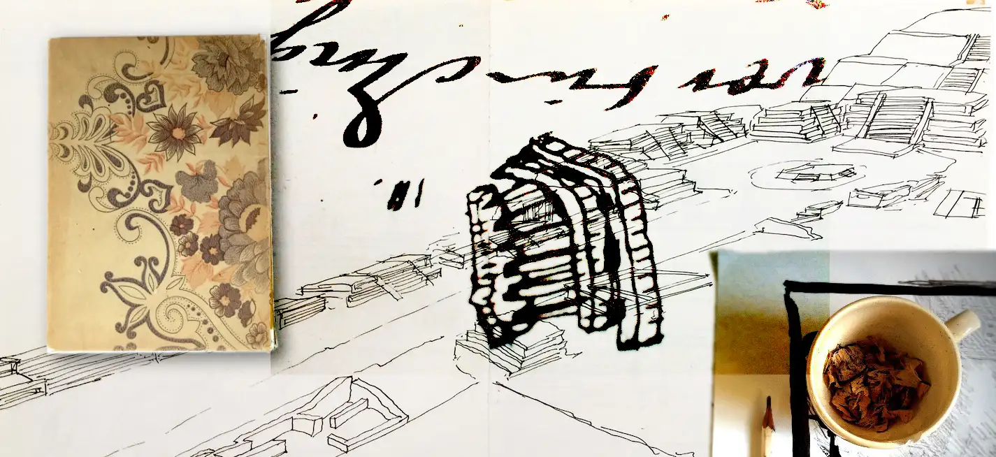
I must have been around 19 years old at the time. Of course, I sketched a lot at the academy, but undertaking a real voyage and preparing it by choosing materials, a notebook, etc. was the first time. The archaeological sites of Tula and Teotihuacan were magnificent. The sun burning. More than 40 years later I can still see myself sitting on top of the moon (the pyramid that is!), sweating and scratching away with a dip pen.

Pen, ink, paper
And while reflecting on the kind of drawings these are, and what materials were used in those days, I came to think about why I wandered off this minimalistic path that I loved so much. One of the reasons why I ventured into publishing later on in my life was because of the admiration I had for editorial illustrations. Large typography with just a single black or red-coloured drawing. My ambition was to do the same with as few instruments as possible: a pen, ink, paper, and the place where I was. Something went wrong. That’s what I see now in those sketches.
Distracting technology
There was no thinking of taking a picture and where to share it. No uploads to networks through quirky hotel Wi-Fi with a strategically chosen hashtag. No worrying about when to post and in which language. In different optimized formats as bite-ready chunks of content for the hungry social media platforms. Don’t get me wrong, I’m a fan of everything new and am amazed by what apps can do these days. I even made a living out of it for the past 25 years! It’s just when it comes down to a good story, visual, written, or both, I believe there’s not much need for FX. Parallax? Scroll effects? Is it necessary? Only good to beef up the lousy stories? Come to think of it, the success of Medium as a platform may well be the best illustration of this.
Melancholia
Good typography, together with layout and illustrations, should be invisible in the sense that it feels like a whole to the reader. It shouldn’t be about which technology was used to make it visually appealing. The power is in the chosen words, in the squiggling of the line, and the soul is the combination of all these elements.
I might clean up my phone by removing some apps soon. Then, I’ll use my fountain pen to write about the incredible thing that happened after I showed these sketches to a Mexican. …
(to be continued)


Early drawings at the archaeological site of Teotihuacan. Pyramids of the moon and sun, the walk of death and a few impressions of a restaurant nearby.


Leave a Reply